Week 9 – Responsive Implementation
Overview
In Week 9, we translated our high-fidelity prototype into a fully functional front-end implementation using HTML, CSS, and JavaScript. The focus was on building a responsive layout that works across mobile and desktop while maintaining consistency with our original design.
My Contribution – Item Listing Page
I implemented the item listing page, bringing the design to life with real layout structure, responsive behavior, and interactive elements. This included adapting the design for both mobile and desktop views while maintaining a consistent visual system.
Desktop Layout
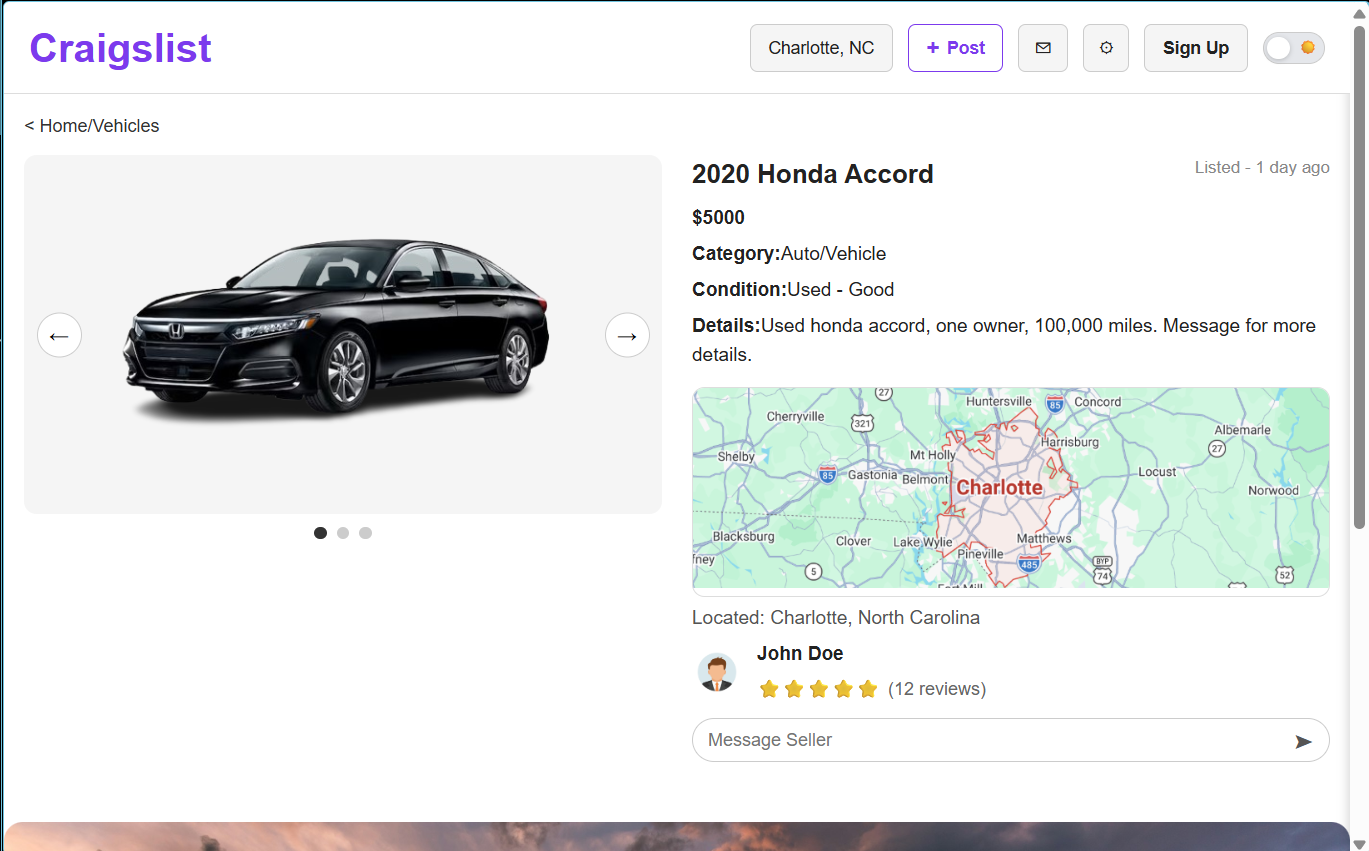
On desktop, the layout uses a two-column structure with the image gallery on the left and item details on the right. Navigation is fully visible, allowing quick access to features such as posting, messaging, and account options.
Mobile Layout
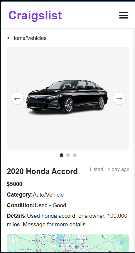
On mobile, the layout shifts to a vertical structure optimized for smaller screens. Navigation is simplified into a hamburger menu, and all content is stacked for easy scrolling and touch interaction.
Responsive Features
- Mobile-first CSS approach with media queries for scaling
- Layout transitions from stacked (mobile) to two-column (desktop)
- Navigation adapts between hamburger menu and horizontal layout
- Touch-friendly buttons and readable text on small screens
- No horizontal scrolling or layout breakage
Navigation Behavior
The navigation system adapts based on screen size. On mobile, a hamburger menu allows users to open and close navigation options. On desktop, navigation is always visible and accessible. This ensures usability across devices while maintaining consistency.
Design Consistency
The implementation maintains the same typography, spacing, and layout structure defined in the prototype. This ensures a cohesive experience across both mobile and desktop views.
Impact
This implementation demonstrates the transition from design to development, ensuring that the interface is not only visually consistent but also functional and usable across devices.